Redirect to CHS blog

Tuesday, December 23, 2014

Type Tuesday - Taylor & Taylor

Type Tuesday will be taking a holiday break until the new year! Until then, enjoy a selection of ephemeral delights from San Francisco printers Taylor & Taylor!

Advertisement for the Packard automobile

Advertisement for the White House department store, San Francisco, CA


Advertisement for the Home Craft Shop, Oakland, CA

Luggage tag for cadets of the Hitchcock Military Academy, San Rafael, CA


Brochure advertisement for Sop-
O-zoN liquid hand soap

See you next on January 6th, 2015!

Jaime Henderson
Archivist

Monday, December 22, 2014

Manuscript Monday—Happy Holidays!

In this week's edition of Manuscript Monday, we present a few lettersheets—near manuscripts, actually, since they were never written on—to welcome the winter holidays. Here's to a warm and convivial holiday season, but don't be like this jolly miner—stay off your horse if you can't tell its head from its hindquarters!

The jolly old miner, California Lettersheet Collection, Kemble Spec Col 09, California Historical Society

Happy New Year, 1856 To all at home, California Lettersheet Collection, Kemble Spec Col 09, California Historical Society

Marie Silva
Archivist & Manuscripts
msilva@calhist.org

Tuesday, December 16, 2014

Type Tuesday - James Conner's Sons Typographic Messenger

More from the Kemble collection's impressive holdings of periodicals on printing! Our holdings include the first issue of The Typographic Messenger, along with a nearly complete run of the circulation.


The Typographic Messenger was the publication of the James Conner’s Sons type foundry of New York. James Conner began his stereotyping and type foundry in 1827. It was first foundry in the United States to introduce light faces. Upon his death in 1861 his sons, William Crawford and James Madison, managed the foundry under the name of James Conner’s Sons. 

The first issue (Vol. 1, Issue 1 of November 1865) began with an introduction proclaiming James Conner's Sons ambivalent feelings regarding the publication of the issue: It is with mixed feelings of pride and diffidence that we commit the first issue of THE TYPOGRAPHIC MESSENGER to the tender mercies of so critical an audience as the followers of the “art preservative:” pride, in the fact that our earnest efforts to produce a unique typographic art-specimen are measurably successful; diffidence, in the consciousness of many imperfections in style, matter and execution.

Despite such trepidation the brother's publication continued on as the bi-monthly mouthpiece of the type foundry. Its mast head read: Vox dicta perit; Litera scripta manet (or Written letter remains the main expression) and issues reported on news from the world of printing and carried advertisements for James Conner's type, along with type made available from other foundries; printing inks, presses and papers; and descriptions and illustrations of typesetting and printing machinery.


A later issue demonstrated a more confident attitude toward their publication. In May of 1869 (Vol. IV, No. 2), James Conner’s Sons themselves became the critical audience in their piece "A Review of Poor Printing": We have before us a newspaper, which, not to particularize too closely, is published in Illinois, that, in a five-line item on intemperance, gives room to a suspicion that the compositor and proof-reader might have been slightly “elevated” at the time of its compilation. “Drunkness” is substituted for the entire word, and “influen-ce” is divided as we here show, by carrying over the last two letters! In the item immediately above this very intemperate paragraph, in speaking of the “American Agriculturist,” the publishers’ names and address are given “ORANGE JUDD & Co., New Bork.” That is enough for one paper.


Along with the advertisements for printing equipment, this volume also offers wood type specimens, from William H. Page & Co. of Greeneville, Connecticut. 


Jaime Henderson
Archivist

Monday, December 15, 2014

Manuscript Monday—Colombian Gold Rush

People are often surprised to discover the geographic breadth of the CHS manuscripts collection. Papers from Mexico, Panama, Chile, Peru, Colombia, and Hong Kong remind us that borders are in a sense a political fiction; California is as much a part of the Pacific Rim as it is a state in the Union. The Asbury Harpending papers (MS 950) are a case in point. After speculating in mining operations throughout the West and Mexico, Harpending turned his unscrupulous eye on Colombia and in its rich gold fields. This payroll statement for March 1890 is representative of Harpending's Colombian adventures. It includes the names of all of the employees of El Cristo Mine, including the women who washed and sorted the ore above ground. Little else is known about these working people—Harpending and business associates likely viewed them as operational costs to be managed and controlled—but documents such as these provide a poignant reminder of their individual humanity, swept up by the powerful forces of international commerce. Each name had a story.

Gold mining continues in Colombia today, often under extremely dangerous conditions. Moving photographs of some of the men, women, and children who work in the mines can be found here: http://www.aljazeera.com/photo_galleries/programmes/2011748834219548.htm

Jornales empleados en el mes de Marzo de 1890, Asbury Harpending papers, MS 950, California Historical Society
Marie Silva
Archivist & Manuscripts Librarian
msilva@calhist.org

Tuesday, December 9, 2014

Type Tuesday - Marcus Brower & Co. of San Francisco

Type Tuesday features local type! Marcus Brower and Co. - printers, bookbinders, engravers, typographers and artists - were located at 300 Broadway, San Francisco. These samples are from an undated Marcus Brower and Co. type specimen. 


Jaime Henderson,
Archivist

Monday, December 8, 2014

Manuscript Monday—Epistolary drama

Processing an archival collection is a lot like watching a baseball game: stretches of mild boredom alternate unexpectedly with moments of great pleasure, excitement, and discovery. This is especially true of the Asbury Harpending papers (MS 950), a collection in which wonderful gems of correspondence are found scattered amongst the most tedious financial records. Many of these letters hint at moments of great personal crisis, the details of which can only be guessed. The letter below, written to Harpending by his longtime associate George D. Roberts, has a desperate Dostoevskian quality typical of Harpending's correspondence; in fact, the sum of money in question (3,000) is exactly the sum so desperately needed by Dmitri in The Brothers Karamazov.
[George D. Roberts?] letter to Asbury Harpending, 1884 November 8, Asbury Harpending papers, MS 950, California Historical Society
Harpending and Roberts had a relationship that would today be termed "dysfunctional," with Roberts often accusing his friend and business associate of false accusations, untruths, and great injustices. Nonetheless, they appear to have stuck it out together. Whether their bond was one of true friendship or complicity (or both) can only be guessed.

Marie Silva
Archivist & Manuscripts Librarian
msilva@calhist.org

Tuesday, December 2, 2014

Type Tuesday - Internationaler Graphischer Muster-Austansch des Deutschen Buchdricker-Vereins

Today we feature some more examples of international print and typography found in our Kemble Collection. These exquisite samples of design are found in an 1891 German volume entitled Internationaler Graphischer Muster-Austansch des Deutschen Buchdricker-Vereins. 


The text of this beautiful sampler is in German and I must admit to my ignorance of the language. I gather that the book was either curated or provided samples of work by members of the German Printers Association of Leipzig, although there are samples from printers all over the European continent.  


The Kemble Collection holds three volumes of Internationaler Graphischer Muster-Austansch des Deutschen Buchdricker-Vereins. Stop by our research library to view in person or stay tuned to Type Tuesdays to see more of these magnificent pieces.

Jaime Henderson
Archivist

Tuesday, November 25, 2014

Type Tuesday - Mergenthaler Linotype Company's Monticello


Monticello typeface, cast in 1796 by Binny and Ronaldson's Philadelphia type foundry, is considered to be the first typeface designed and manufactured in the United States. As a transitional serif typeface, Monticello was a departure from the Old Style tradition of type, where there was little variance of thick and thin strokes, small, short serifs, and which more closely resembled the human movement of the hand, toward the Modern typeface with designs reflecting sharper forms, higher contrast and less humanistic movement as presses become more industrialized. 


In the 1940s, Mergenthaler Linotype Company's Vice President for Typeface Development, Chauncey H. Griffith, partnered with Princeton University Press' P.J. Conkwright to embark on the laborious task of converting Monticello hand-set type to Linotype. Their work, finally completed in 1949, was displayed in the fifty volume Papers of Thomas Jefferson, published by the Princeton University Press. 

Mergenthaler Linotype Company promoted Monticello's "inherent readability" and "optical harmony," making the typeface an ideal choice for the printing of books and newspapers throughout the 1950s. In the mid-1960s Mergenthaler seems to seek out a different audience. Their advertisement, seen below, attempts to sell hip art directors - who were probably up to their necks with ad copy printed in Cooper Black and Helvetica type - on the staid Monticello type. A wig stand donning a Thomas Jefferson-style coif espouses the modern-ness of Monticello typeface to a seemingly indifferent wig stand sporting a severe brushcut.


The ad copy encourages the "astute art director" to bring the "back-country Baskerville" to modern day swinging uptown. The "back-country Baskerville" being a playful derision of Monticello type. Monticello, Virginia, home to Thomas Jefferson, was certainly a back country burg compared to England's bustling 18th century Birmingham, where Baskerville, another serif transitional type, was designed by John Baskerville in 1757.

Here is a complete specimen of Mergenthaler's Monticello type.


Jaime Henderson,
Archivist

Monday, November 24, 2014

Manuscript Monday—"Idiom tudor," "I am afraid"

The Asbury Harpending papers (see last week's post) contain scores of ciphered telegrams and letters. While a key exists to help decipher the correspondence of the early 1870s, later telegrams are encoded according to a different system (and represent Harpending's continuing speculation on the mining stock market after the Diamond Hoax fiasco). The only clue to this system is the two-sided telegram reproduced below. On the reverse, Harpending decoded his associate's ominous words—"Idiom tudor," "I am afraid."


Castings telegram to Asbury Harpending, 1881, Asbury Harpending papers, MS 950, California Historical Society

Marie Silva
Archivist & Manuscripts Librarian
msilva@calhist.org

Tuesday, November 18, 2014

Type Tuesday - Hamiltons Specimens of Wood Type Faces

The Hamilton Manufacturing Company, of Two Rivers, Wisconsin, offered a variety of wood types, including ornaments, silhouettes, perpetual calendars and borders, in the 17th edition of their Specimens of Wood Type. 


Wood type was a popular alternative to metal type because large letters - perfectly suited for broadsides and large format advertising - could be more reliably and cheaply produced than metal type. 


The Hamilton Wood Type and Printing Museum in Two Rivers, Wisconsin houses the Hamilton Manufacturing Company's collection of 1.5 million pieces of wood type and is dedicated to the preservation, study, production and printing of wood type. 


Jaime Henderson,
Archivist

Monday, November 17, 2014

Manuscript Monday—Swindlers and ciphers

It's not every day that an archivist gets to catalog a collection with the subject headings, "Swindlers and swindling" and "Cipher and telegraph codes," so I felt like a kid on Christmas morning when I discovered the cipher key reproduced below in the papers of the extravagantly named Asbury Harpending.

Harpending was a secessionist conspirator (pardoned by President Lincoln in 1864) with an insatiable appetite for investment and speculation in mining ventures throughout the Western United States and Mexico. His name will forever be associated with the Diamond Hoax, that great swindle uncovered by geologist Clarence King in 1872. Papers at CHS provide a fascinating, if befuddling, record of Harpending's role in the scam. Note the ciphers for diamonds, rubies, and sapphires in the key below. Was Harpending really an innocent dupe? This archivist is not convinced.


Key to cipher, 1871?, Asbury Harpending papers, MS 950, California Historical Society
Marie Silva
Archivist & Manuscripts Librarian
msilva@calhist.org

Tuesday, November 11, 2014

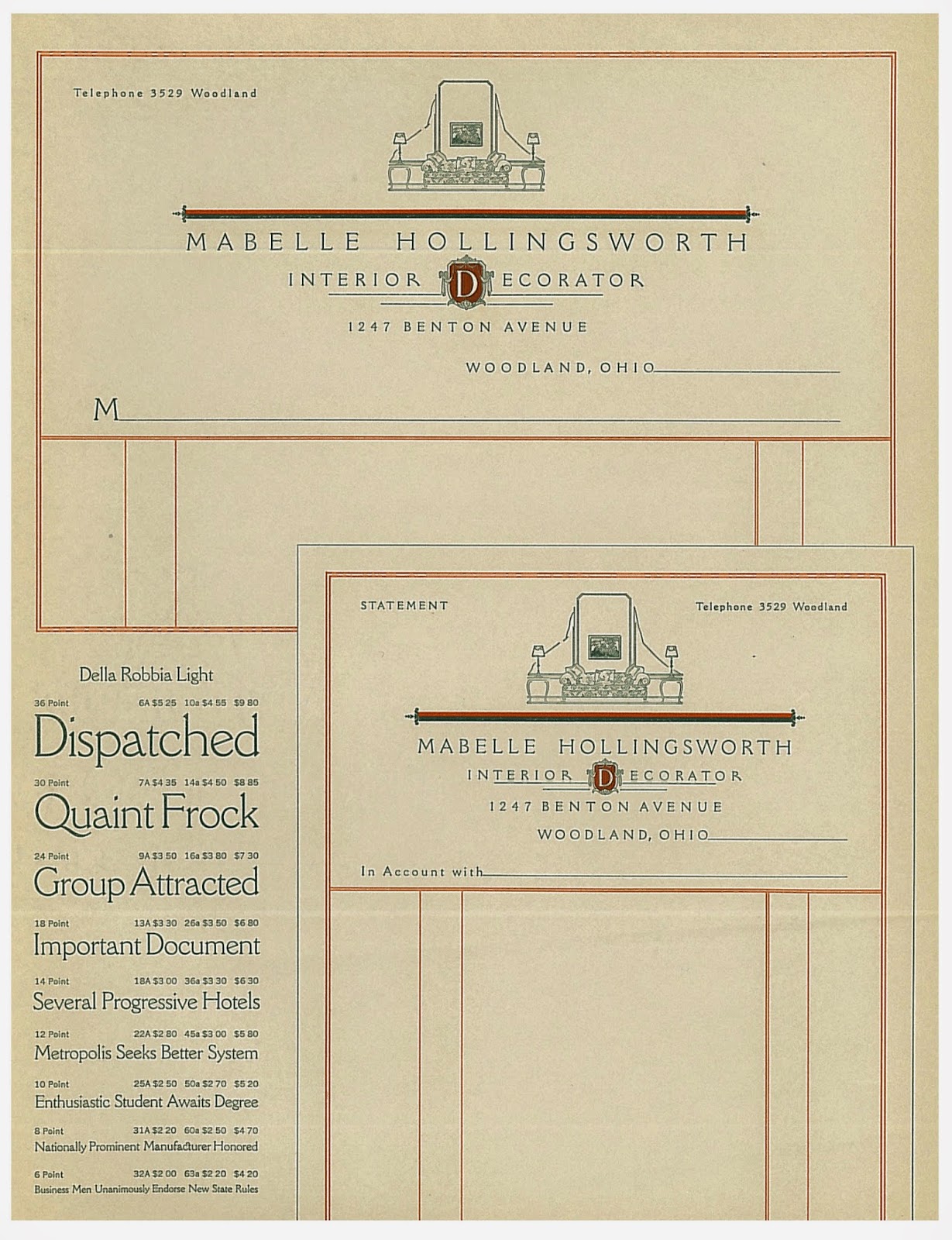
Type Tuesday - More American Type Founders Company's business stationery

The American Type Founders Company offered so many examples of beautiful business stationery we are featuring a few more of our favorites in this week's Type Tuesday!


Your letters are your own personal representatives. 


Considering its appeal, the extra cost of good stationery is negligible.


Quality stationery instantly creates a most favorable impression. 


Good paper and effective typography answers the stationery question.


Jaime Henderson,
Archivist