Redirect to CHS blog

Tuesday, June 30, 2015

Type Tuesday - Cover design for PM magazine


PM, a trade publication dedicated to the work and stylish inclinations of production managers, was started in 1934 by the PM Publishing Company of New York. As a publication of Sol Cantor and Dr. Robert L. Leslie's type firm The Composing Room, PM provided young American art directors with an introduction to modern design, especially the work of European designers and styles. 


German graphic and type designer Lucian Bernhard acted as guest art director for the March 1936 issue of PM (see above). An overview of the designer's work, including his most well-known type, Bernhard Gothic, was featured in this issue of PM.


After an eight year run, the publication's focus on graphic design brought about a title change to AD, and Intimate Journal for Production Managers, Art Directors, and their Associates.  Stay tuned for an upcoming Type Tuesday dedicated to the covers of AD!


Both PM and AD are available for viewing in the California Historical Society's library, open to the public Wednesday through Friday from 12-5. 


Jaime Henderson,
Archivist
jhenderson@calhist.org

Friday, June 26, 2015

70 Years Ago, a City Embraced the Future: San Francisco and the United Nations Charter


It was late April 1945 and the war in Europe was nearing an end. On April 29, German forces surrendered in Italy. The next day, Adolf Hitler committed suicide. A few days later in Berlin, Soviet forces captured the German Reichstag. As combat to end World War II continued, in San Francisco there was talk of peace and an international solution to future conflict.

Thursday, June 25, 2015

Oil Wells on Court Street from Bixel

Oil Wells on Court Street from Bixel. Anton Wagner (Photographer), 1933, gelatin silver print, California Historical Society, CHS2012.833.
By Shelly Kale
“This lovely place, cuckoo land, is corrupted with an odd community giddiness. . . . Nowhere else do eccentrics flourish in such close abundance. Nowhere do spiritual or economic panaceas grow so lushly. Nowhere is undisciplined gullibility so widespread.”(1)
So the cultural milieu of Los Angeles appeared to the editors of Life in 1930 as a new decade began—one defined nationwide by the harsh economic realities of the Great Depression. On the streets of metropolitan Los Angeles, however, a different outsider perspective was emerging.

Wednesday, June 24, 2015

Historic Techniques: A Series about the Intersection of Art, Science, and History


By Ben Wood

The genesis of the program series Historic Techniques originated, perhaps fittingly, with a chance meeting at the vintage paper fair at the Golden Gate Park botanical garden in the autumn of 2013. The California Historical Society had a booth, and while I was perusing the antique post card collection with the assistance of my wife, I came across their booth. This auspicious meeting, and subsequent discussions gave birth to the concept of a series that looks at how contemporary artists and media makers create relevant work that bridges the past and future. Early on we sought out ways to engage the community with techniques that local artists are borrowing from the past.

Tuesday, June 23, 2015

Type Tuesday - Champion Papers

Today we feature a personal favorite from the Kemble Collection on Western Printing and Publishing - Champion Paper Company's series of catalogs entitled Imagination. 

The following images come from the Wild West-themed Imagination IV. 


Cover, Imagination IV

The company produced these fantastic, stylish catalogs "as an example of what can be done when you think of paper as an integral part of your communications" and included whimsical ideas about the use of their products. 

Below is an example of a Wild West board game. 


Here is the exterior and interior of cut-and-fold  stagecoach!


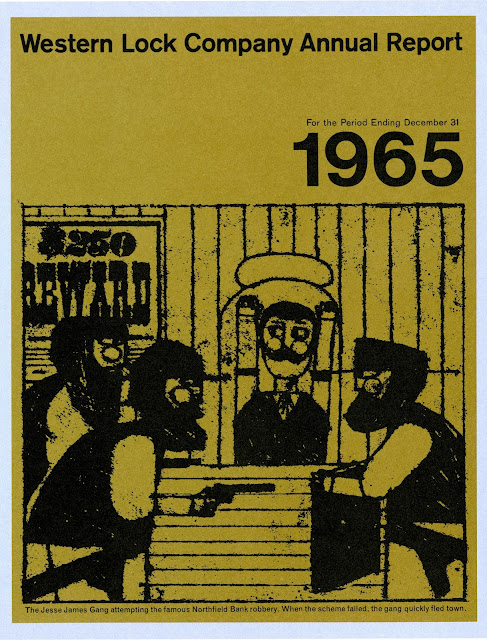
And, here, an Annual Report.


The Texas Ranger Kit is a "premium idea for a breakfast cereal manufacturer."


Below, a moo-ving suggestion for a company's catalog cover. (Har har!) 


And finally, the catalog closes with an idyllic, embossed image of a Wild West town. 


Champion Paper Company produced a series of their Imagination catalogs, all of them as striking as today's feature. Stay tuned to Type Tuesday to see them all!

Jaime Henderson,
Archivist

Monday, June 22, 2015

Manuscript Monday—Colonial violence and the Rogue River Wars


Historian Boyd Cothran has written a wonderful, disturbing, and important book, Remembering the Modoc War: Redemptive Violence and the Making of American Innocence (The University of North Carolina Press, 2014). In it, he makes the case that different marketplaces (beginning with the Gilded Age press) commodified the history of U.S. violence against Native people in the Klamath Basin, reproducing “the myth of American innocence” that continues, today, to justify U.S. imperialism. Cothran argues that the Modoc War was preceded by decades of settler and military violence perpetuated against Natives throughout southern Oregon and northern California. The Cayuse War, the Rogue River Wars, the Ben Wright Massacre, and the Crosby Expedition can all be understood as part of this larger pattern of colonial violence.

The California Historical Society has in its collection the papers of Captain Bradford Ripley Alden, a West Point graduate and veteran of the Seminole Wars, who raised a party of two hundred volunteers to suppress the Indians of the Rogue River Valley in 1853. Much of the collection consists of Alden’s letters to his wife, written before and after the battle of August 24, 1853, near Jacksonville, Oregon, in which he was critically injured. The letters are interesting for what they leave out: any personal reflections on the justification for or meaning of the military campaign Alden was charged with leading. Instead, Alden ruminates on typical nineteenth-century themes: duty and piety; love for wife and home; and the rugged manly healthfulness of frontier living: “The physical effect of this pure high air is surprising on me—my hair is blacker, my flesh harder, my legs stronger, and my equanimity a surprise to myself.” Following Cothran’s argument, one could say that Alden presents himself as an American innocent.

The following letter was written by Morris S. Miller to Colonel Freeman after the battle of August 24, 1853, informing Freeman that Alden’s wound was not dangerous, contrary to reports published in the local newspapers. Miller’s letter is an interesting reminder of the role of the nineteenth-century press in spreading rumor, misinformation, and hyperbole about U.S.-Indian violence in the West, a theme which Cothran explores in his book. 


Morris S. Miller letter to Col. W.G. Freeman, 1853 September 7, Bradford Ripley Alden papers, MS 29, California Historical Society
Marie Silva
Archivist & Manuscripts Librarian
msilva@calhist.org

Tuesday, June 16, 2015

Type Tuesday - Hermann Zapf

Type Tuesday honors the passing of Hermann Zapf, who by his own admission received a "B" in penmanship in grade school, but grew to become one of the most prolific and honored designers in the world of type design. Zapf died June 4th, 2015 in Darmstadt, Germany at the age of 96. Here is but a small sampling of Zapf's fonts from his 1960 Typophile Chap Book About Alphabets: Some Marginal Notes on Type Design.


Jaime Henderson
Archivist
jhenderson@calhist.org

Monday, June 15, 2015

MS Monday—PPIE Part 8: The Historic American Buildings Survey and the Panama Canal Zone

The recent and fascinating issue of Boom magazine reminds us that the Panama-Pacific International Exhibition (PPIE) was a celebration of California’s imperial ambitions in the Pacific, marked by the opening of the Panama Canal in 1914. The tiny Isthmus of Panama—at its narrowest point only 30 miles across—has long been the focus of imperial concern and contestation, beginning in the 16th century and continuing until the present day. Throughout the twentieth century, the United States has maintained an active “interest” in Panamanian affairs, exercising sovereignty over the Panama Canal Zone from 1903 to 1979. Ten years after the abolition of the zone, the U.S. invaded Panama, ousting its president Manuel Noriega.

Fort San Lorenzo, main entrance to the port, by M.E. Beatty, 1957 February, Historic American Buildings Survey (HABS) records, MS 3980
Geopolitical struggles over the Isthmus of Panama are nothing new. Beginning in the sixteenth century, the isthmus was a major artery in the flow of wealth from the Americas to the coffers of the Spanish empire. Fort San Lorenzo, pictured above and below, was built by the Spanish at the mouth of the Chagres River to protect the isthmus from the depredations of British privateers like Sir Francis Drake. Surprisingly, the California Historical Society’s collections contain photographs of Fort San Lorenzo—created as part of the Historic American Buildings Survey, a program of the National Park Service founded during the Great Depression to employ out-of-work architects, photographers, and draftsmen to document the nation’s threatened architectural heritage. As Fort San Lorenzo was part of the U.S.-controlled Panama Canal Zone, HABS recorders traveled to Panama to document the fort and other Spanish colonial structures in the late 1950s. These photos represent a truly odd confluence of historical forces: Spanish colonialism, the U.S. occupation of Panama, and the New Deal.

Fort San Lorenzo, quarry steps on the fort headland, by M.E. Beatty, 1957 February, Historic American Buildings Survey (HABS) records, MS 3980
Fort San Lorenzo, the fort from the bank of the Chagres, by M.E. Beatty, 1957 February, Historic American Buildings Survey (HABS) records, MS 3980
Marie Silva
Archivist & Manuscripts Librarian

Tuesday, June 9, 2015

Type Tuesday - Acme Wood Type and Manufacturing Company


 Selections from Acme Wood Type Manufacturing Company's 1937 catalog.


Jaime Henderson
Archivist
jhenderson@calhist.org

Tuesday, June 2, 2015

Type Tuesday - Fat Faces

Today's Type Tuesday features images from a periodical available in our Kemble Collection, Alphabet and Image: A Quarterly of Typography and Graphic Arts.  Published in London by the Shenval Press from 1946 to 1948, Alphabet and Image enjoyed an eight issue run. The Kemble Collection holds all but the inaugural issue. 


As a place for typographers, illustrators and graphic designers to publish histories, criticisms and their own research on type and design, the quarterly featured articles such as A.F. Johnson's Fat Faces: Their History, Forms and Use. All of the following images come from Johnson's article on the Fat Face font. 


According to Johnson, the earliest known appearance of Fat Faces are in 19th-century English advertising mediums such as theatre bills, lottery advertisements, posters, leaflets, title pages of pamphlets, and broadsides, "especially those relating to sensational happenings, murders, deaths by fire" and any other ghastly crimes or accidents that might have befallen a British person in the early to mid-1800s.


Founder Robert Thorne is credited with the first usage of Fat Faces, and other foundries such as Bower and Bacon (1810), Figgins (1816), W. Caslon IV (1816) and L. Pouchee (1819) soon followed. 


Johnson points out that Fat Face is a 20th-century title given to a 19th-century created font that is very similar to other classical modern faces of the time period which featured thin, flat serifs with an abrupt contrast of thick and thin strokes. In the case of Fat Faces, the contrast of thick and thin strokes was greatly exaggerated. 


Alphabet and Image: A Quarterly of Typography and Graphic Arts is just one example of the typography, graphic design and printing periodicals available in the California Historical Society's Kemble Collection on Western Printing and Publishing. Please visit us in our research library to view materials from the Kemble Collection, open Wednesday through Friday, 12 - 5. 

Jaime Henderson,
Archivist